Legal design
The problem: Shrap, a startup app designed to remove the need for cash, wanted to redesign their terms of service to make them easier to understand and let customers be better informed. I worked with one of the best legal designers in the business to research, redesign and user test the revised design. The purpose of the redesign was to help the customers and businesses understand what Shrap is and how it works, in a format they were more likely to engage with.
Combined methods user research
Work started with understanding the orignal terms of service. These were the typical ‘wall of text” that users expect and ignore:
“Shrap may limit, suspend, revoke, terminate, modify, or delete Your Account or access to the Service and/or Wallet at its sole discretion without prior notice or liability, if You are, or if Shrap suspects (in its sole discretion) that You are failing to comply with these Terms or for any actual or suspected Restricted Use of the Services.
Upon termination of your account, Shrap is under no obligation to compensate you for any losses resulting from the cease of services.
If you wish to terminate your account, you may do so at any time by contacting us at: contact@shrap.co.uk
The services and all associated content, including without limitation, the use of our software, web technologies, source code, concepts, artwork, photos, animations, sounds, methods of operation, moral rights, documentation, and virtual items (collectively, “Service Materials”), is the exclusive property of Shrap, or is being used with permission from its licensors.”
Initial rewrite
The initial rewrite took the terms and make them more readable by rewording the copy from ‘legalese’ into something that could be understood by nonspecialists.
One of Shrap’s target users was people who make more use of cash, who tend also to be from socioeconomic groups that may struggle more, so this initial rewrite enabled a broader range of users to be engaged in the research. In the process, additional material provided by Shrap was incorporated to help address questions raised in the initial review of the Terms.
User research
8 research interviews were conducted: 4 with prospective customers (a mix of genders and socioeconomic backgrounds), and 4 with small business owners who were also prospective users. All the interviews explored basic demographics, how the interviewees used cash, feedback on Shrap as a concept, and feedback on the revised terms, to understand what areas mattered most to the users.
Redesign
2 approaches were prototyped in Axure:
One broke the content down into chunks displayed using labelled icons
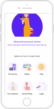
The other used a linear structure with chunks broken up with icons and headings
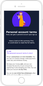
Each approach broke the content down into chunks that made sense, and to structure those chunks based on user needs, with key terms called out in the copy, and the language itself in a simpler, more engaging style.
User testing
A/B testing was performed with 6 users, 2 of whom had taken part in the research. In each case, participants were:
Introduced to the Shrap concept
Scenario: “You are signing up for a Shrap account and need to read and accept the terms. Looking at the prototype, please read through and think aloud as you are reading.”
Spent 2-3 minutes looking at first one, then the other prototype, thinking aloud
Asked for preference (with rationale), and asked which of the areas in the prototype would be of most relevance to them when signing up
Asked questions to check their understanding of the Terms
Asked for any final thoughts on the 2 prototypes

“I already prefer this … this is so much cooler”
Jasmine, 17
“I do like the little clicky buttons to go to the bit you’re interested in.”
Jacqui, 52
“I like the precis at the start, I never usually read the whole Terms.”
Caroline, 48
“I prefer the language in this one.”
Roisin, 67
“I like this, but with summaries.”
Sotiris, 35
Result
The final design, informed by the research and testing, was a variant of the labelled icon approach and can be explored on Shrap’s own website. It was well received by the client, and the work included in their promotional material.